


Frequently Asked Question
Learn how to use our plugins with step-by-step guides and practical examples
Layout
The Layout section is split into two tabs: Dimensions and Colors.
On the Dimensions tab:
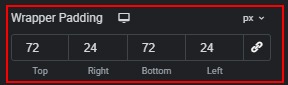
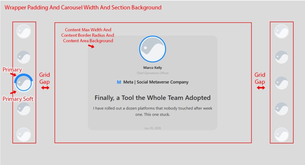
- Wrapper Padding (responsive) — padding around the entire widget section.
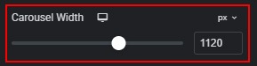
- Carousel Width (responsive) — maximum width of the carousel container.
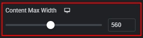
- Content Max Width (responsive) — maximum width of the active content panel.
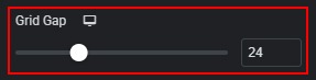
- Grid Gap (responsive) — space between the navigation panels and the content area.
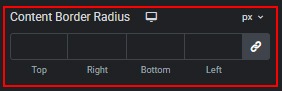
- Content Border Radius (responsive) — rounds the corners of the active content card.
On the Colors tab:
- Primary — main accent colour used for rings, borders, and progress indicator.

- Primary Soft — lighter tint of the primary colour used for active thumbnail backgrounds and rings.

- Section Background — background colour of the outer section wrapper.

- Content Area Background — background colour of the active content card.

 Style
Style