


Frequently Asked Question
Learn how to use our plugins with step-by-step guides and practical examples
Carousel Settings
The Carousel Settings section is organised into four tabs: Autoplay, Navigation, Animation, and Display.
On the Autoplay tab:
- Enable Autoplay — turns automatic slide rotation on or off.

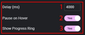
When autoplay is enabled, the following options become available:
- Delay (ms) — time in milliseconds between slide changes (range: 1000–20000, default: 4000).
- Pause on Hover — pauses the autoplay when the cursor is over the widget.
- Show Progress Ring — shows an animated ring on the active thumbnail indicating the time remaining before the next slide.
- Loop — when enabled, the carousel restarts from the beginning after the last slide.

- Start Index — sets the index of the slide that is shown first (0-based, default: 0).

On the Navigation tab:
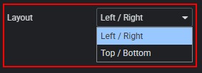
- Layout — controls where the thumbnail navigation is placed relative to the content.
Options:
1. Left / Right — navigation panels appear on the left and right sides of the content area.
2. Top / Bottom — navigation panels appear above and below the content area.
- Split Mode — defines how thumbnails are distributed between the two navigation panels.
Options:
1. Odd / Even — odd-indexed thumbnails go to the left/top panel, even-indexed to the right/bottom.
2. Sequential Halves — the first half of thumbnails goes to the left/top panel, the second half to the right/bottom panel.

- Visible Thumbnails (responsive) — the total number of thumbnails shown across both panels. (Defaults: Desktop 10 · Tablet 6 · Mobile 6. Must be an even number (step: 2) so both panels receive the same amount.)

On the Animation tab:
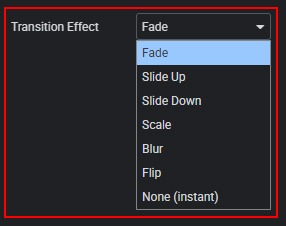
- Transition Effect — the animation played when switching between testimonials.
Options:
1. Fade — cross-fade between slides.
2. Slide Up — new content slides in from below, old content slides out upward.
3. Slide Down — new content slides in from above, old content slides out downward.
4. Scale — new content scales up from small to full size, old content scales down.
5. Blur — old content blurs and fades out, new content fades in sharp.
6. Flip — a 3-D flip effect.
7. None (instant) — immediate switch with no animation.
- Duration (ms) — length of the transition animation in milliseconds (range: 100–1500, default: 400). Visible only when the Transition Effect is not “None”.

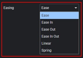
- Easing — the acceleration curve applied to the animation.
Options:
1. Ease
2. Ease In
3. Ease Out
4. Ease In Out
5. Linear
6. Spring
7. Visible only when the Transition Effect is not “None”.
On the Display tab:
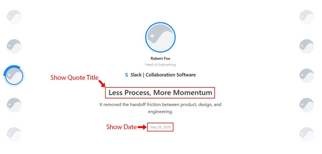
- Show Quote Title — shows or hides the quote headline inside the content area.

- Show Date — shows or hides the publication date inside the content area.

 Content