


Frequently Asked Question
Learn how to use our plugins with step-by-step guides and practical examples
Thumbnails
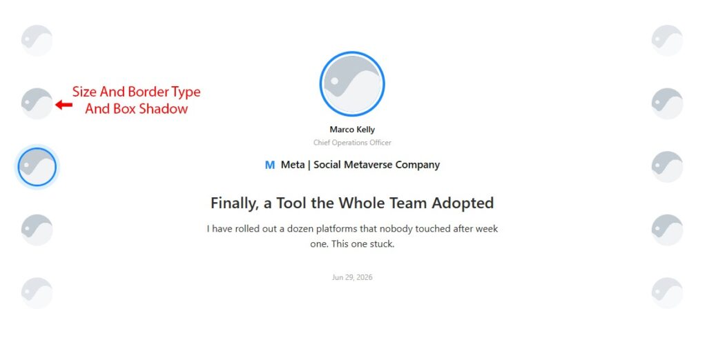
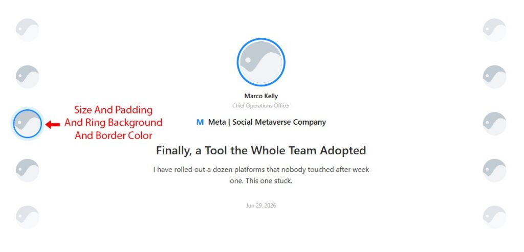
The Thumbnails section controls the appearance of small avatar sketches in the navigation panels. The section is split into three tabs: Normal, Hover, and Active.
On the Normal tab:
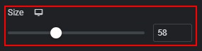
- Size (responsive) — diameter of each thumbnail image.
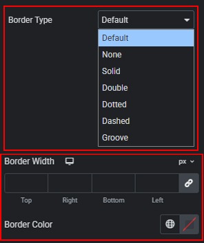
- Border — border style, width, and color for thumbnail images.
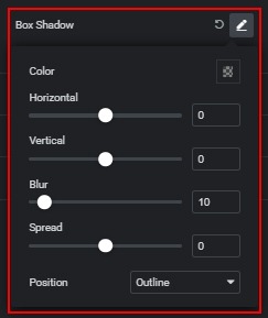
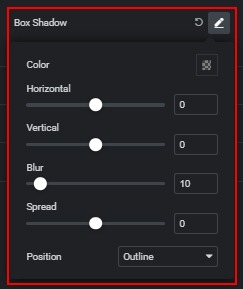
- Box Shadow — shadow applied to thumbnail images.
On the Hover tab:
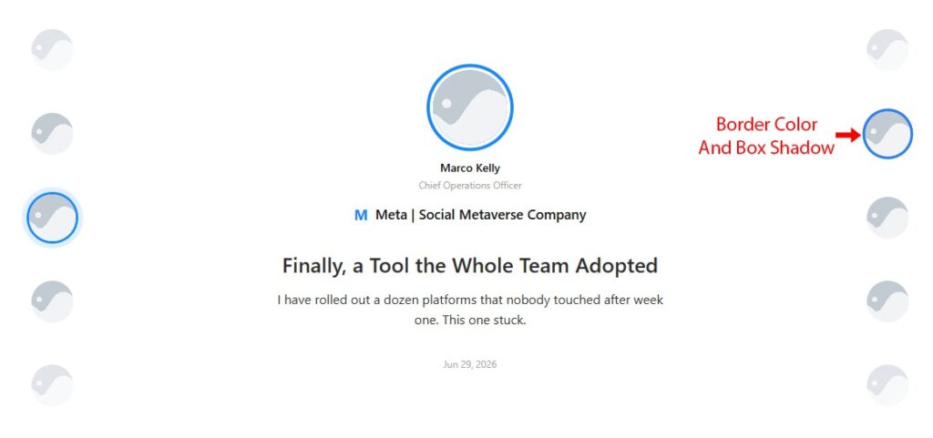
- Border Color — border colour of the thumbnail image on mouse hover.

- Box Shadow — shadow applied to the thumbnail image on mouse hover.
On the Active tab:
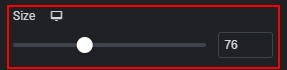
- Size (responsive) — diameter of the currently active thumbnail.
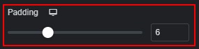
- Padding (responsive) — space between the active thumbnail image and its highlight ring.
- Ring Background — fill colour of the highlight ring around the active thumbnail.

- Border Color — border colour of the image inside the active thumbnail ring.

 Layout