Frequently Asked Question
Learn how to use our plugins with step-by-step guides and practical examples
Popup Styles
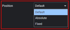
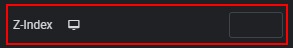
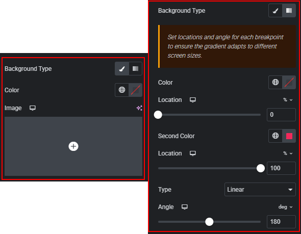
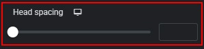
The Popup Styles section allows you to:
- Select the pop-up position.
- Adjust the pop-up z-index.
- Customize the pop-up background with color, image, positioning, resizing, or gradients.
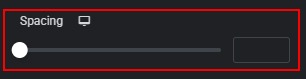
- Change spacing between the image and text in the pop-up header.
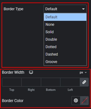
- Select and customize the pop-up border type, width, and color.
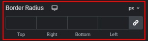
- Set the pop-up border radius using selectable or custom units.
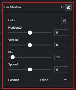
- Add a box shadow to the pop-up.
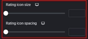
- Adjust spacing and size of rating star icons in the pop-up.
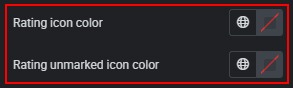
- Set colors for filled and unfilled rating icons in the pop-up.
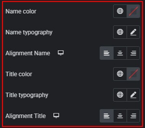
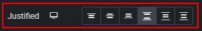
- Customize the color, typography, and alignment of Name and Title in the pop-up.
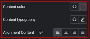
- Change the color, typography, and alignment of the description text in the pop-up.
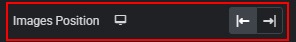
- Change the image position (left or right) in the pop-up.
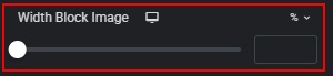
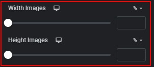
- Set the image block size, width, and height using %, px, or custom units in the pop-up.
- Customize image borders, border radius, and box shadow in the pop-up.


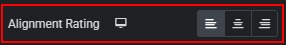
- Set alignment for Rating on different screen sizes in the pop-up.
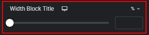
- Define block widths for Name, Title, and Rating in the pop-up.
- Align the pop-up header block vertically.
- Adjust spacing between Rating, Name, and Title in the pop-up.
 Slider Styles