


Frequently Asked Question
Learn how to use our plugins with step-by-step guides and practical examples
Navigation
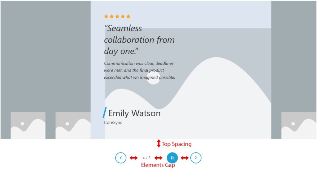
The Navigation section is available only when Show Navigation is enabled in Options. It styles the control bar displayed below the widget.
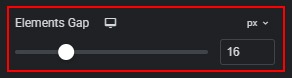
- Elements Gap — sets the spacing between navigation controls (arrows, counter, play/pause). Available units: px, rem. Default: Desktop/Tablet 16px, Mobile 12px. Range: px 0–60.
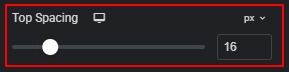
- Top Spacing — sets the margin above the navigation bar, below the widget panels. Available units: px, rem. Default: Desktop/Tablet 16px, Mobile 12px. Range: px 0–80.
- In the Arrows tabs, you can:
- Normal state:
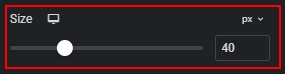
- Size — sets the width and height of each arrow button. Available units: px, rem. Default: Desktop/Tablet 40px, Mobile 36px. Range: px 24–80. The arrow icon scales proportionally inside the button.
- Color — sets the icon and border color of arrow buttons in normal state. Default: #1d9fd9.

- Background — sets the background color of arrow buttons in normal state. Default: transparent.

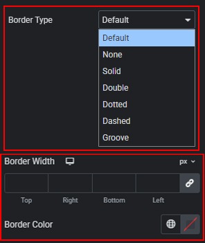
- Border — customize the arrow button border. Default: 2px solid #1d9fd9. Set border type, width, and color.
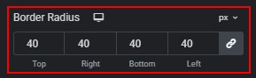
- Border Radius — sets the corner rounding of arrow buttons. Default: 50% on all breakpoints (circular buttons).
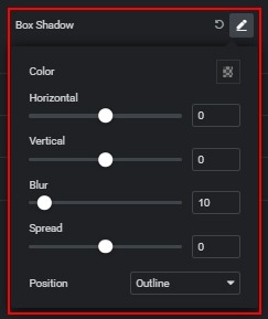
- Box Shadow — adds a shadow to arrow buttons.
- Hover state:
- Color — sets the icon and border color when hovering arrow buttons. Default: #ffffff.

- Background — sets the background color when hovering arrow buttons. Default: #1d9fd9.

- Disabled state:
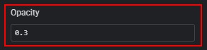
- Opacity — sets the opacity of disabled arrow buttons when Loop is off and the first or last item is reached. Default: 0.3. Range: 0 to 1, step 0.01.
- In the Counter tabs, you can:
- Color — sets the text color of the counter (for example, 2 / 4).

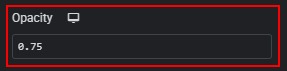
- Opacity — sets the opacity of the counter text. Default: 0.75 on all breakpoints. Range: 0 to 1, step 0.01.
- Typography — customize counter typography.

- In the Play / Pause tabs, you can:
- Playing state (autoplay active):
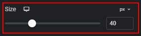
- Size — sets the width and height of the play/pause button. Available units: px, rem. Default: Desktop/Tablet 40px, Mobile 36px. Range: px 24–80.
- Icon Color — sets the icon color while autoplay is running. Default: #ffffff.

- Background — sets the background and border color while autoplay is running. Default: #1d9fd9.

- Paused state (autoplay stopped):
- Icon Color — sets the icon and border color when autoplay is paused. Default: #1d9fd9.

- Background — sets the background color when autoplay is paused. Default: transparent.

- Hover state:
- Icon Color — sets the icon color when hovering the play/pause button.

- Background — sets the background and border color when hovering the play/pause button.

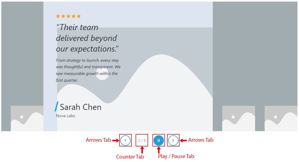
 Image States