


Frequently Asked Question
Learn how to use our plugins with step-by-step guides and practical examples
Image States
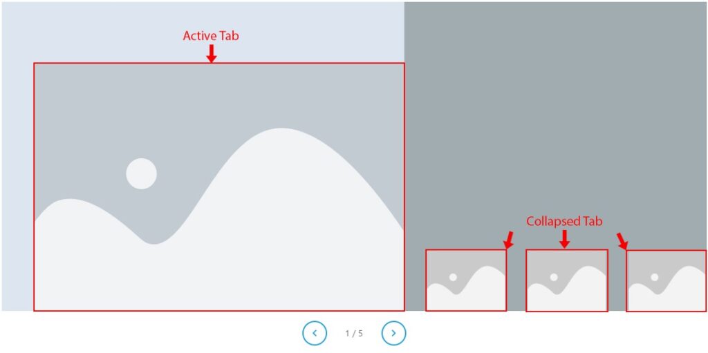
The Image States section controls author photo appearance in collapsed and active states.
- In the Collapsed tabs, you can:
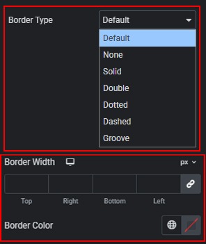
- Border — customize the border of the collapsed image wrapper. Set border type, width, and color.
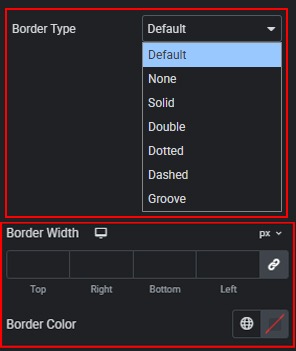
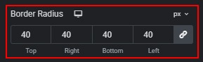
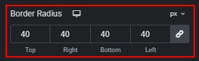
- Border Radius — sets corner rounding for the collapsed image wrapper. Available units: px, %, em, rem, custom.
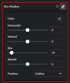
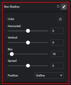
- Box Shadow — adds a shadow to the collapsed image wrapper.
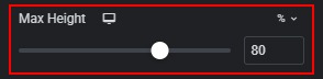
- Max Height — sets the maximum height of the collapsed photo. Available units: %, px, custom. Default: 80% on Desktop and Tablet. Range: % 40–100, px 80–600.
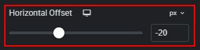
- Horizontal Offset — shifts the collapsed photo horizontally along the right edge. Available units: px, custom. Default: -20px on Desktop and Tablet. Range: -80px to 80px. Negative values move the image outward; positive values move it inward.
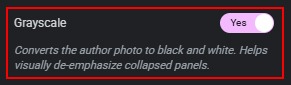
- Grayscale — converts the collapsed photo to black and white. Enabled by default (Yes). Helps visually de-emphasize inactive panels. When disabled, the photo keeps its original colors.
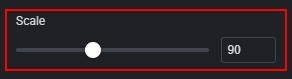
- Scale — sets the size scale of the collapsed photo wrapper. Unit: %. Default: 90%. Range: 50%–150%.
- In the Active tabs, you can:
- Border — customize the border of the active image wrapper. Set border type, width, and color.
- Border Radius — sets corner rounding for the active image wrapper. Available units: px, %, em, rem, custom.
- Box Shadow — adds a shadow to the active image wrapper.
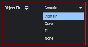
- Object Fit — controls how the image fills its container. Options: Contain, Cover, Fill, None. Default: Desktop/Tablet Contain, Mobile Cover.
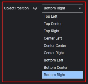
- Object Position — sets the focal point of the image inside its container. Options: Top Left, Top Center, Top Right, Center Left, Center Center, Center Right, Bottom Left, Bottom Center, Bottom Right. Default: Desktop/Tablet Bottom Right, Mobile Top Center.
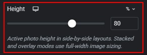
- Height — sets the height of the active photo in side-by-side layouts. Available units: %, px, custom. Default: Desktop/Tablet 80%, Mobile 100%. Range: % 40–100, px 80–600. Stacked and overlay layouts use full-width image sizing from Layout → Content instead.
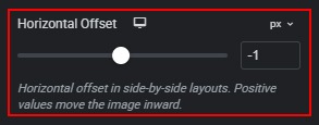
- Horizontal Offset — fine-tunes the horizontal position of the active photo in side-by-side layouts. Available units: px, custom. Default: Desktop/Tablet -1px, Mobile 0px. Range: -80px to 80px. Positive values move the image inward.
 Content