


Frequently Asked Question
Learn how to use our plugins with step-by-step guides and practical examples
Layout
The Layout section contains three tabs: Section, Items, and Content.
- In the Section tab, you can configure the overall widget container:
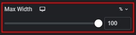
- Max Width — sets the maximum width of the widget. Available units: px, %, vw, custom. Default: 100%. Range examples: px 200–2000, % 10–100, vw 10–100.
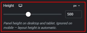
- Height — sets the height of the panel row on desktop and tablet. Available units: px, vh, custom. Default: Desktop 500px, Tablet 420px. Range examples: px 200–900, vh 20–100. This setting is ignored on mobile, where panel height is automatic.
- Alignment — sets the horizontal alignment of the widget inside its Elementor column. Options: Left, Center, Right. Default: Center.

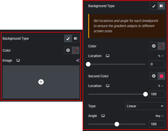
- Background — customize the widget section background. You can set a classic color background, background image with position and size, or a gradient background.
- In the Items tab, you can configure collapsed panel strips and shared panel styling:
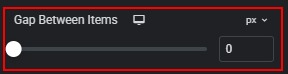
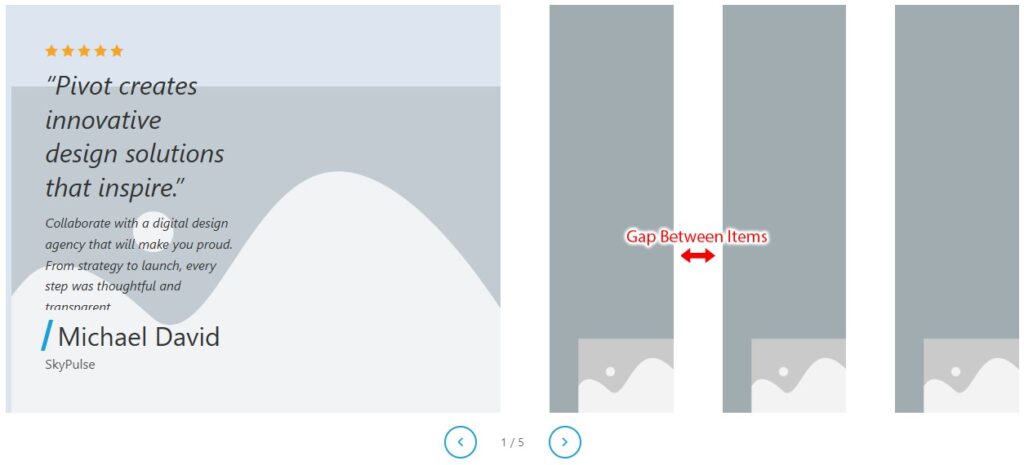
- Gap Between Items — sets the horizontal space between panels. Available units: px, rem, custom. Default: 0px on all breakpoints. Range: px 0–60, rem 0–4.
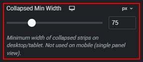
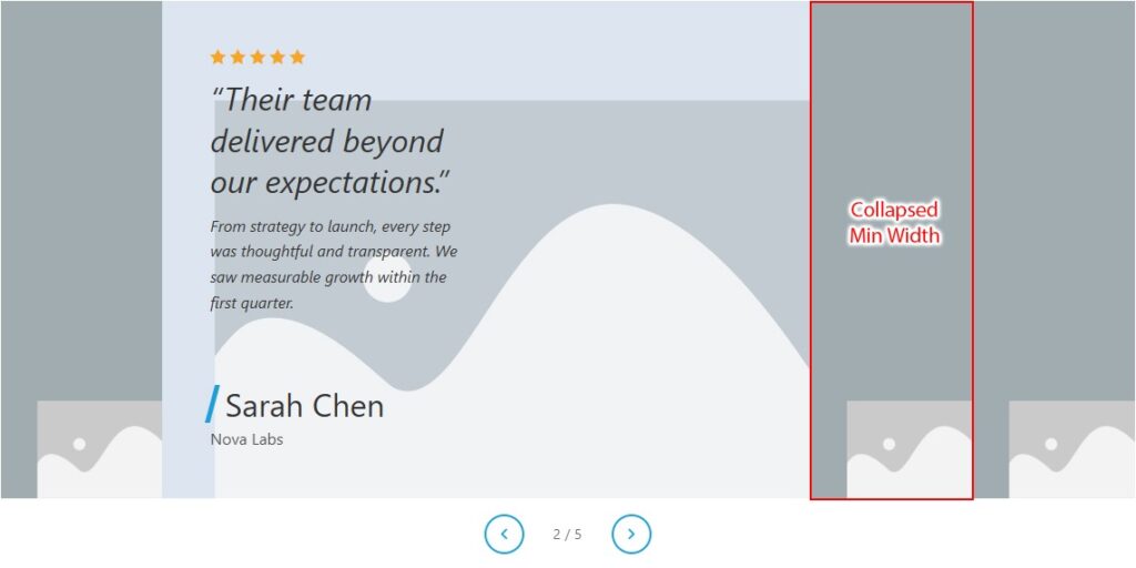
- Collapsed Min Width — sets the minimum width of each collapsed panel strip on desktop and tablet. Available units: px, rem, custom. Default: Desktop 75px, Tablet 56px. Range: px 30–200, rem 1–12. Not used on mobile because only one active panel is shown.
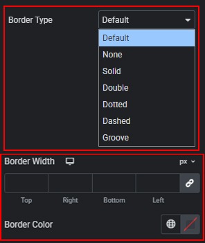
- Border — customize the border of each panel. You can set border type (solid, double, dotted, dashed, none), border width for each side, and border color.
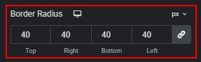
- Border Radius — sets corner rounding for all panels. Available units: px, %, em, rem, custom. Controls each corner independently.
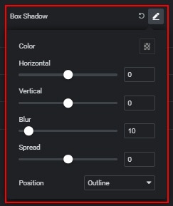
- Box Shadow — adds a shadow to all panels. You can customize horizontal offset, vertical offset, blur, spread, color, and position.
- In the Content tab, you can configure how text and image are arranged inside the expanded (active) panel.
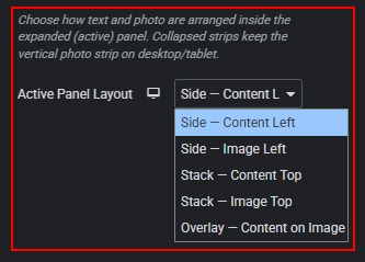
- Active Panel Layout — selects the layout mode for the expanded panel on the current breakpoint.
Options:
– Side — Content Left: text on the left, image on the right. Default on Desktop and Tablet.
– Side — Image Left: image on the left, text on the right.
– Stack — Content Top: text above image.
– Stack — Image Top: image above text. Default on Mobile.
– Overlay — Content on Image: full-size background image with text overlay.
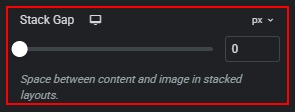
- Stack Gap — sets the space between the text block and the image in stacked layouts. Available units: px, rem, custom. Default: Desktop/Tablet 0px, Mobile 16px. Range: px 0–80, rem 0–5.
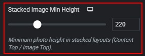
- Stacked Image Min Height — sets the minimum photo height in stacked layouts. Unit: px. Default: Desktop 220px, Tablet 200px, Mobile 180px. Range: 100–500px.
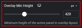
- Overlay Min Height — sets the minimum height of the active panel in overlay layout. Available units: px, vh, custom. Default: Desktop 420px, Tablet 360px, Mobile 320px. Range: px 200–800, vh 20–100.
- Content Position — sets the vertical position of the text block over the image. Options: Top, Middle, Bottom. Default: Desktop/Tablet Middle, Mobile Bottom.

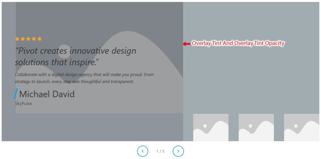
- Overlay Tint — sets the color of the semi-transparent overlay placed over the background image. Default: #000000.

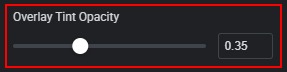
- Overlay Tint Opacity — sets the strength of the overlay tint. Range: 0 to 1, step 0.05. Default: 0.35.
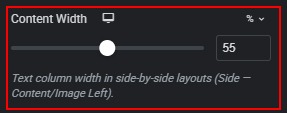
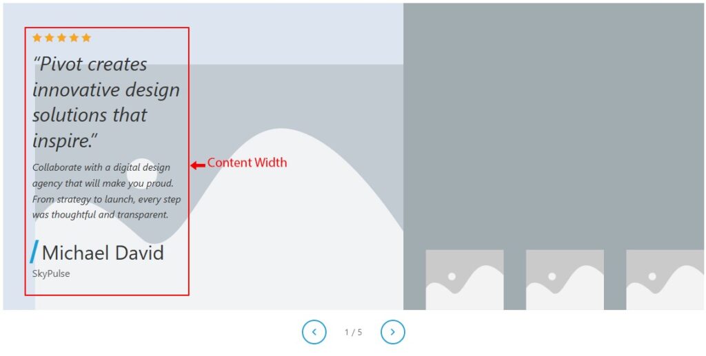
- Content Width — sets the width of the text column in side-by-side layouts. Available units: %, px, custom. Default: Desktop/Tablet 55%, Mobile 60%. Range: % 30–80, px 200–800.
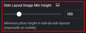
- Side Layout Image Min Height — sets the minimum photo height in side-by-side layouts, especially on mobile. Unit: px. Default: 180px on all breakpoints. Range: 100–400px.
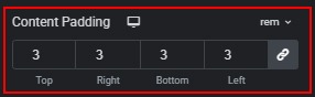
- Content Padding — sets inner padding inside the text block. Available units: px, %, em, rem, custom. Default: Desktop 3rem, Tablet 2rem, Mobile 1.25rem (linked on all sides).
- Vertical Alignment — sets the vertical alignment of content inside the text block. Options: Top, Middle, Bottom. Default: Desktop/Tablet Middle, Mobile Top. Not used in overlay layout — use Content Position instead in overlay mode.
 Style
Style