Frequently Asked Question
Learn how to use our plugins with step-by-step guides and practical examples
Popup Styles
The Popup Styles tab includes:
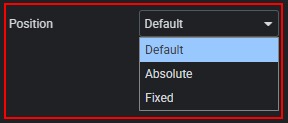
- Selecting the pop-up position.
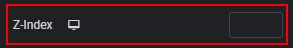
- Adjusting the pop-up z-index.
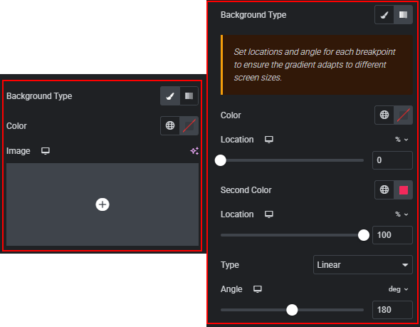
- Changing the pop-up background: set a color, add an image, adjust its position and size, or use a gradient.
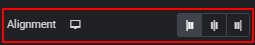
- Changing the alignment of the Image block and the Name/Title block in the pop-up.
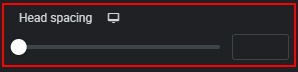
- Adjusting the spacing between the image and text in the pop-up header.
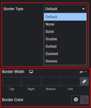
- Selecting and customizing the pop-up border type, width, and color.
- Setting the pop-up border radius using predefined or custom units.

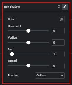
- Adding a box shadow to the pop-up with advanced settings.
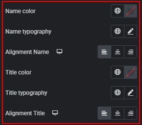
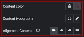
- Customizing the color, typography, and alignment of the Name and Title.
- Customizing the color, typography, and alignment of the description.
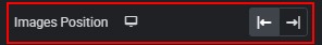
- Changing the image position (left or right) in the pop-up.
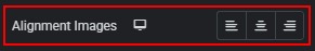
- Changing image alignment in the pop-up.
- Adjusting the image container size using %, px, or custom units in the pop-up.
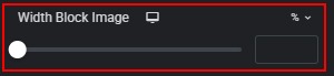
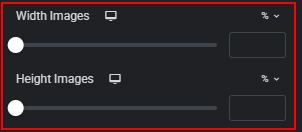
- Changing the image width and height using %, px, or custom units in the pop-up.
- Selecting and customizing the image border type, width, and color in the pop-up.

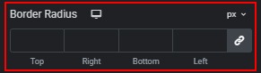
- Setting the image border radius using predefined or custom units in the pop-up.
- Adding a box shadow to the image in the pop-up.

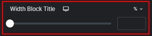
- Adjusting the block width of the Image, Name, and Title in the pop-up.
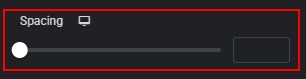
- Setting the spacing between the Image, Name, and Title in the pop-up.
 Slider Styles