Frequently Asked Question
Learn how to use our plugins with step-by-step guides and practical examples
Tab Styles
In the Tab Styles section, you can:
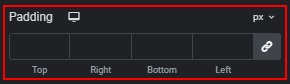
- Adjust the outer padding for tabs.

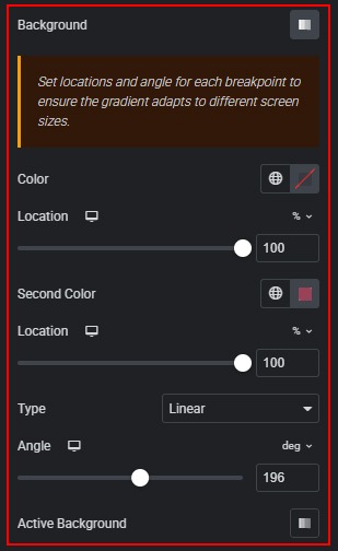
- Customize the background of default and active tabs using a gradient.
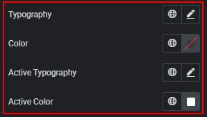
- Change the color and typography of the title for default and active states.
- Adjust the outer padding for buttons.
- Customize the default and hover button background by setting a color, adding an image, adjusting its position and size, or using a gradient.

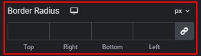
- Set the button border radius using predefined or custom units.
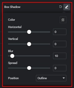
- Add a box shadow to the button with advanced settings.
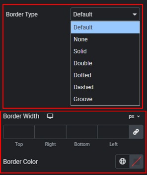
- Select and customize the button border type, width, and color.
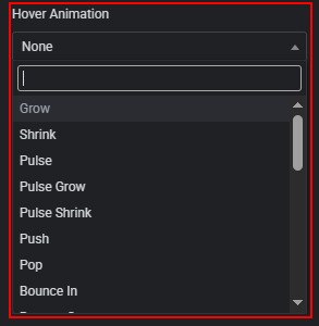
- Add hover animations for the buttons.
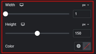
- Change the divider width, height, and color.
 Global Styles